17
May/050
May/050
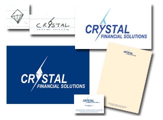
Crystal Logo Development
 David Morely came to us for a new business start-up. He had the name ‘Crystal Financial Solutions’ and wanted two shades of blue for the corporate image.
During our first meeting the art director sketched the little diamond shape, a couple of days later the idea of using the ‘y’ in crystal as a container for the crystal materialized.
David and his wife and business partner Anita were delighted with the outcome, we were able to quickly move forward with the project. Stationery was prepared and the all important brochure.
Comments (0)
Trackbacks (0) ( subscribe to comments on this post )
No comments yet.
Sorry, the comment form is closed at this time.
No trackbacks yet.

