Maritime Anti-Piracy – The Captain’s Guidebook
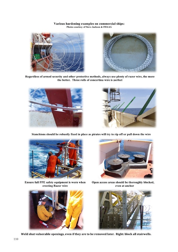
When Maritime Security Expert, Peter King, completed a three year project, a comprehensive, up-to-date and definitive handbook to help Shipping Companies, CSOs and Captains of all vessels withe in-depth information on all ways to protect their crew, vessel, and cargo from thieves and armed pirates around the world, he brought it to EuropeAxess Media for publishing.
Pete was pretty happy with the contents and typography he had been working on all that time, and really wanted to publish the book under his company name. We were able to take over the project as a ‘Print Management’ team, where we could lend a hand was to tickle the layout into shape where he had burst the capabilities of ‘Microsoft Word’. With specialist knowledge in the maritime industry, we were also able to help out with proofreading. Many of the images Pete had, which were taken in the field, sometimes at night or in difficult lighting situations, were low resolution and we were also able to enhance and sharpen many of these. Finally we helped with the ISBN registration.
We had the 376 page handbook printed in full color throughout, and bound in hardback with a matt black cover, making a valuable addition to any ship’s library. In fact we recommend larger ships take two, one to be in the Captain’s possession, and the other to be lodged in the ships safe room, as the information it provides is invaluable in a hi-jack scenario, with useful contact information of private Maritime Security agencies.
As Pete’s work, as a Maritime Security Consultant for IMAAG, the International Maritime Anti-Piracy Advisory Group, takes him all over the world he asked if we could help with the book marketing admin. And so we undertook the distribution of sample copies to prospective purchasers, as per his marketing partner’s instructions. The latest information we have is that a major book wholesaler in the UK has expressed an interest in carrying the title after finding it in the ISBN catalogue.
Lithographic Printing

Choose your corporate Pantone colour
We offer an extensive range of printing services thanks to over 20 years experience of print providers, we now work with a number of trusted specialist printers both locally and internationally.
For larger quantities of premium quality printing we recommend Lithographic Printing known as ‘Litho’. Litho is a method using a metal plate with a completely smooth surface on which oil is applied to divide the smooth surface into hydrophobic regions which accept the ink, and hydrophilic regions which reject it. The inked image is transferred from the plate to a rubber blanket and then to the paper, card or other printing surface (samples of printable surfaces can be provided on request). The word Lithography is from Greek ‘lithos’ (stone) and ‘grapho’ (to write). It was invented in 1796 originally using a limestone.

CMYK process colors spectrophotometrically monitored
If we are designing your artwork for you then you can rest assured that it will have been created within the strict guidelines required to assure that the printed product looks as much like your proof as is realistically possible. Factors such as colour can be points of contention, if your chosen colours are very specific e.g. corporate colours, then we will provide the printer with your
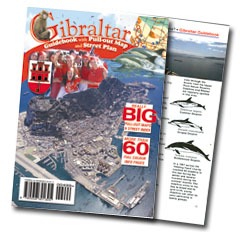
More..Gibraltar Guide Book
 It had long been an ambition of the team to produce a good street map for Gibraltar, something that was felt to be sadly wanting by locals and tourists alike.
In publishing the Gibraltar Guidebook with a full colour map showing the whole of the Rock on one side and a large scale plan of the shopping centre on the reverse we achieved our ambitions.
The full colour map was painstakingly prepared with the greatest attention to detail, but was well worth the effort proving to be a popular item with several sales outlets in Gibraltar.
Rock and Fortress Project
 With assets consisting of a network of World War II tunnels, an album of black and white photographs and a 19 year old logo Richard Desoiza of ‘Let’s Go’ set about creating a new tourist destination for Gibraltar.
First of all we re-drew and enhanced the logo, originally drawn in the 80’s, then we digitised the excellent black and white war time photos.Using these assets we created a 1940’s style image, developing this in exterior posters, interior display modules and signage, flyers, advertisements. We augmented the launch publicity with P.R. both on Radio and in the local press.
Crystal Brochure
 Crystal Financial Solutions were offering an innovative product to the Spanish market whereby homeowners could mitigate their exposure to inheritance tax.
This required specialist financial copy to give a clear and concise explanation of the scheme which was aimed at fund managers and legal advisors to recommend to their clients.
With a selection of relevant photos, pull quotes and the financial data packaged in easy to read tables, a great deal of complex legalistic data was presented in an uncomplicated and attractive format.
Crystal Logo Development
 David Morely came to us for a new business start-up. He had the name ‘Crystal Financial Solutions’ and wanted two shades of blue for the corporate image.
During our first meeting the art director sketched the little diamond shape, a couple of days later the idea of using the ‘y’ in crystal as a container for the crystal materialized.
David and his wife and business partner Anita were delighted with the outcome, we were able to quickly move forward with the project. Stationery was prepared and the all important brochure.


